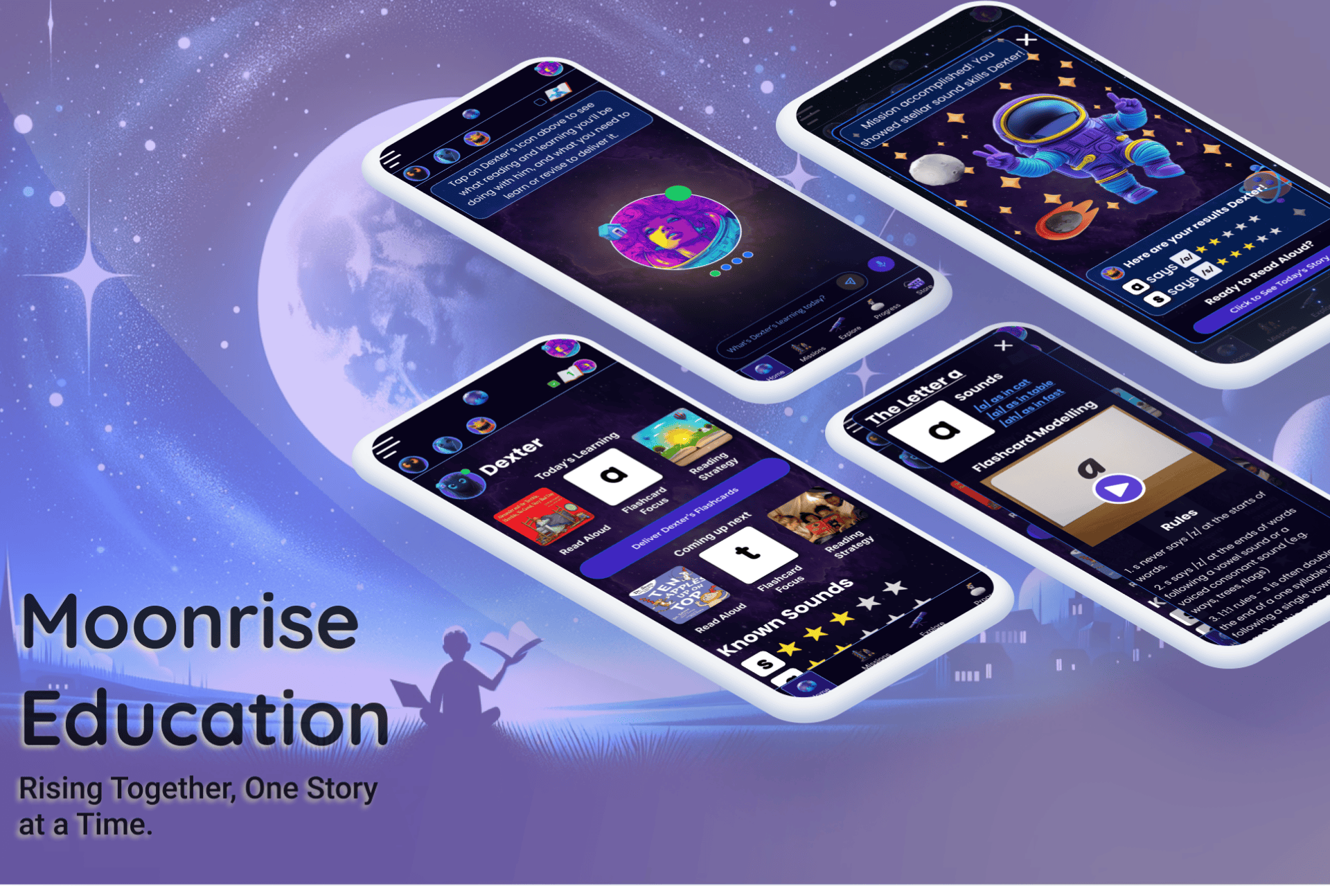
My Designs


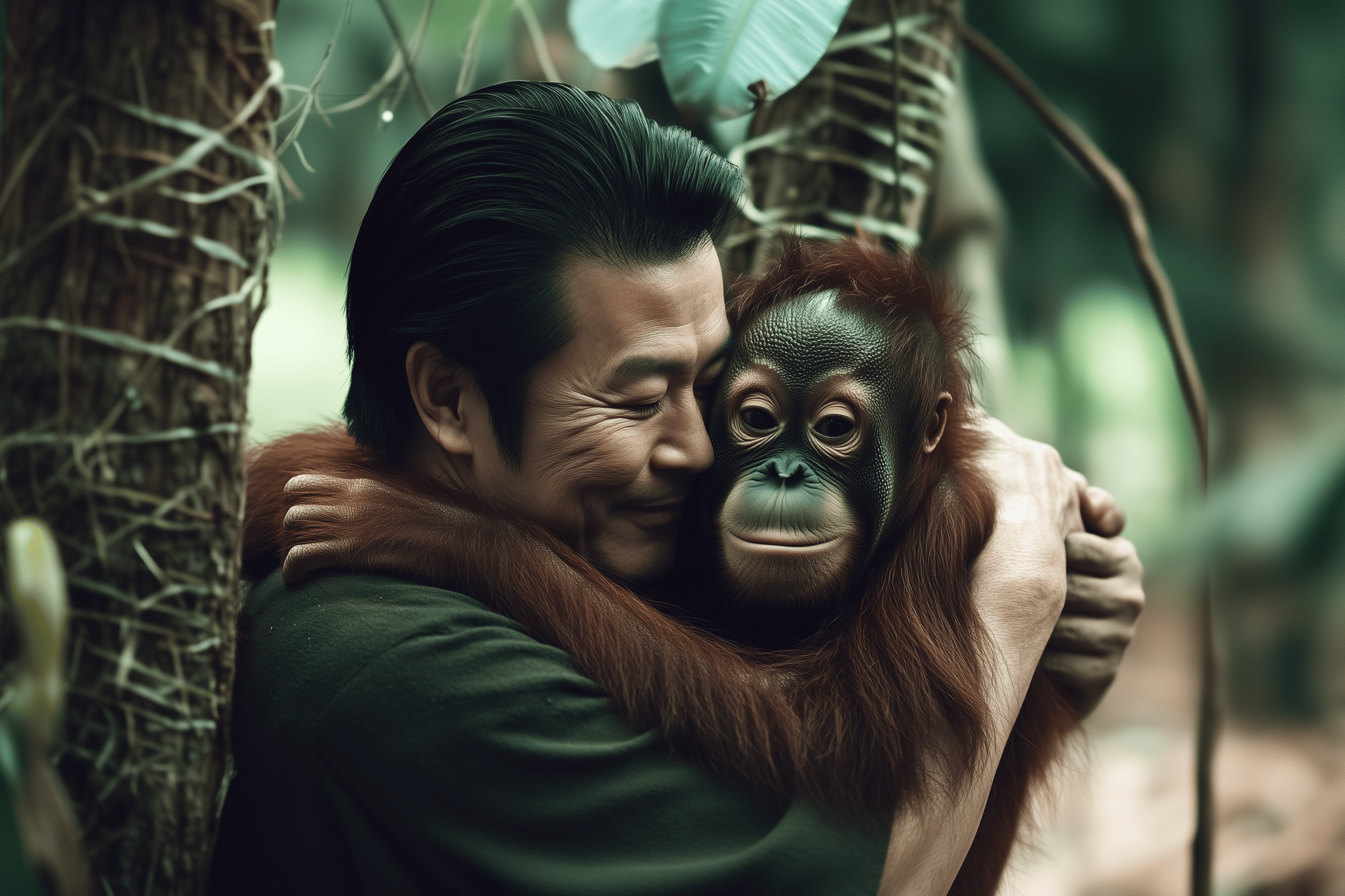
Supporting the Environment with Art
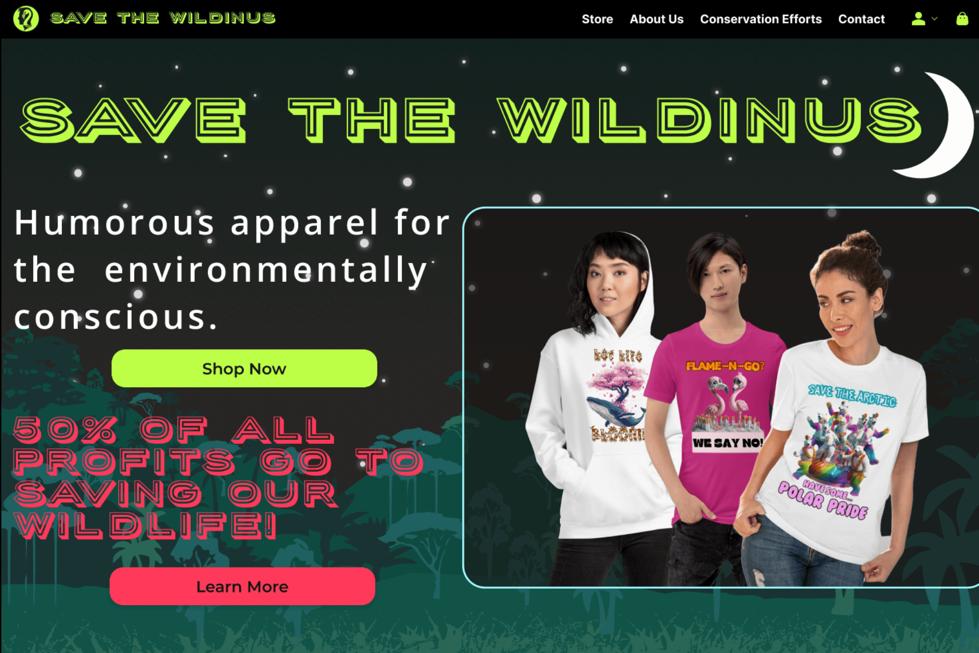
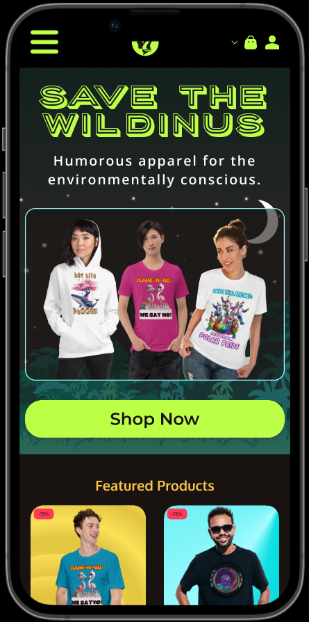
Save the Wildinus
Save the Wildinus is a purpose-driven clothing brand that merges art, advocacy, and sustainability. The brand’s core mission is to create engaging, artistic apparel with punchy, clever slogans that let people visibly show their support for wildlife and habitat conservation and encourages them to reconnect with nature and befriend their 'wild side'.
Services Rendered:
Branding, UI/UX Design, Visual and artistic design, Product Design, Content Creation
Industry:
Retail
Tools:
Figma, Midjourney, Canva, Clip Studio Pro
http://www.savethewildinus.com
Empathize
I began this project by conducting user interviews, focus groups, and a detailed competitive analysis. I wanted to understand why eco-conscious shoppers sometimes struggle to find products that both resonate with their personal style and directly support conservation efforts.
Users:
- Environmentally conscious consumers looking for ethical apparel
- Passionate wildlife supporters who want to make a tangible impact
- Casual shoppers interested in unique, artistic designs

Pain Points
Shoppers were often unsure how their purchases contributed to wildlife protection.
They wanted more than just a “green” label; they craved clear, honest brand storytelling.
The steps from finding their item to checkout were sometimes too many.
Artistic, bold designs were a major draw, but also needed to be aligned with the cause.
Ideate

To devise a compelling solution, I brainstormed and drafted initial concepts for brand visuals, layout structures, and messaging.
What I Explored:
- Branding Concepts: Earthen color palettes and nature-inspired imagery that would visually stand out and reinforce the environmental theme in branding & design.
- Product Catalog Layouts: Sketched out a few options that clearly showcased the designs.
- Storytelling Elements: Ways to integrate charity spotlights, mission statements, and impact metrics directly into the shopping flow.
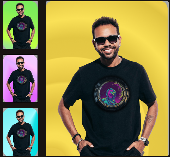
- Product Designs: I created the visual art and slogans that would go on the clothing products.
My early ideation showed that:
- The Earthen tone color palette was not capturing attention. Customers wanted a more vibrant and edgy feel that would connect to the younger generation.
- The Logo was too busy and not easily identifiable. Something simpler that evoked humanity's connection to nature was needed.
- More clarity on the charity donation aspect was needed. Customers are sick of brands green washing and wanted to KNOW that their money is going to good causes.
- Simplicity in user flows (browse → select → buy) is crucial to keep momentum going.
- The initial designs were liked but customers wanted a broader range, with many asking for non-activist designs.
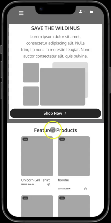
Testing Image Layouts
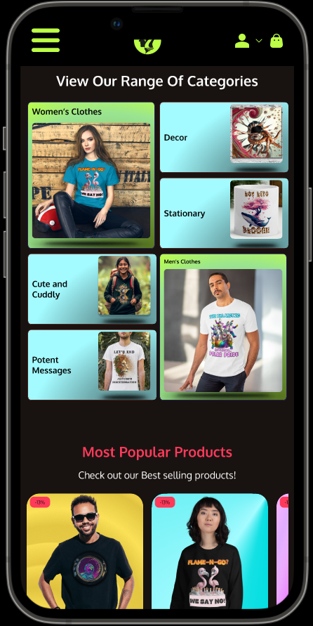
On the home page I experimented with different image layouts, focusing on how best to showcase product categories and popular items. The goal was to make sure visitors could quickly grasp what’s available and easily move on to browse specific sections.
Feedback
Users appreciated the clear structure and range of categories but suggested adding small previews of key designs or bestsellers to spark immediate interest. They also recommended more direct calls-to-action near the “Most Popular Products” to guide them smoothly toward deeper product exploration.
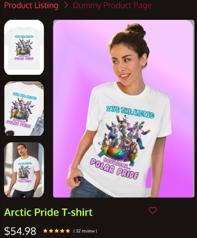
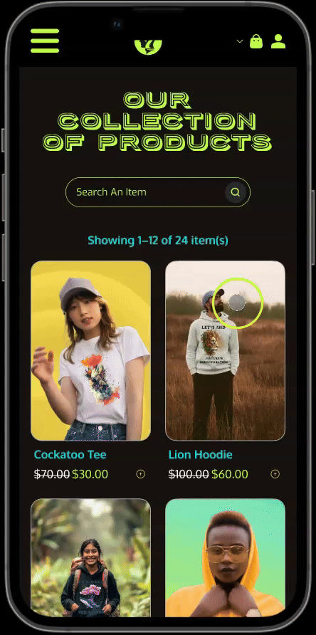
The Collection page
I created this low-fidelity prototype for the collection page to test core functionality and user flow. Using simple placeholders for products allowed us to focus on navigation and structure—ensuring users could easily browse, select items, and move on to checkout.
Feedback
Users found the minimal interface straightforward but suggested that the product cards could be slightly bigger, filling the space more effectively and allowing for larger product images.
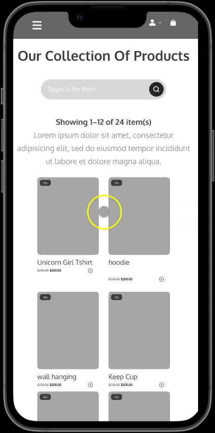
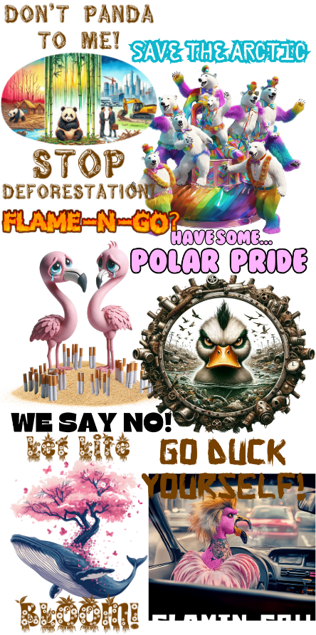
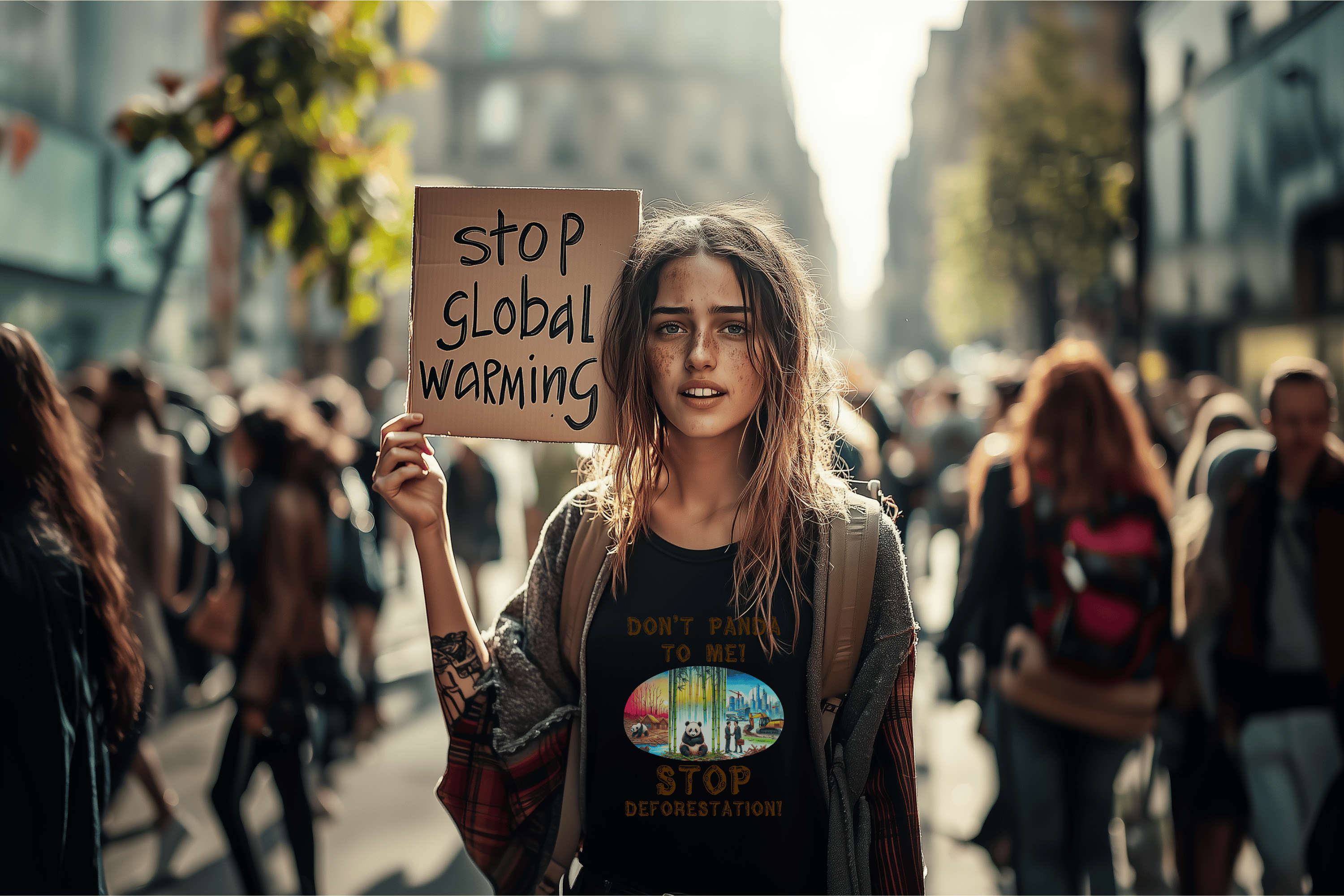
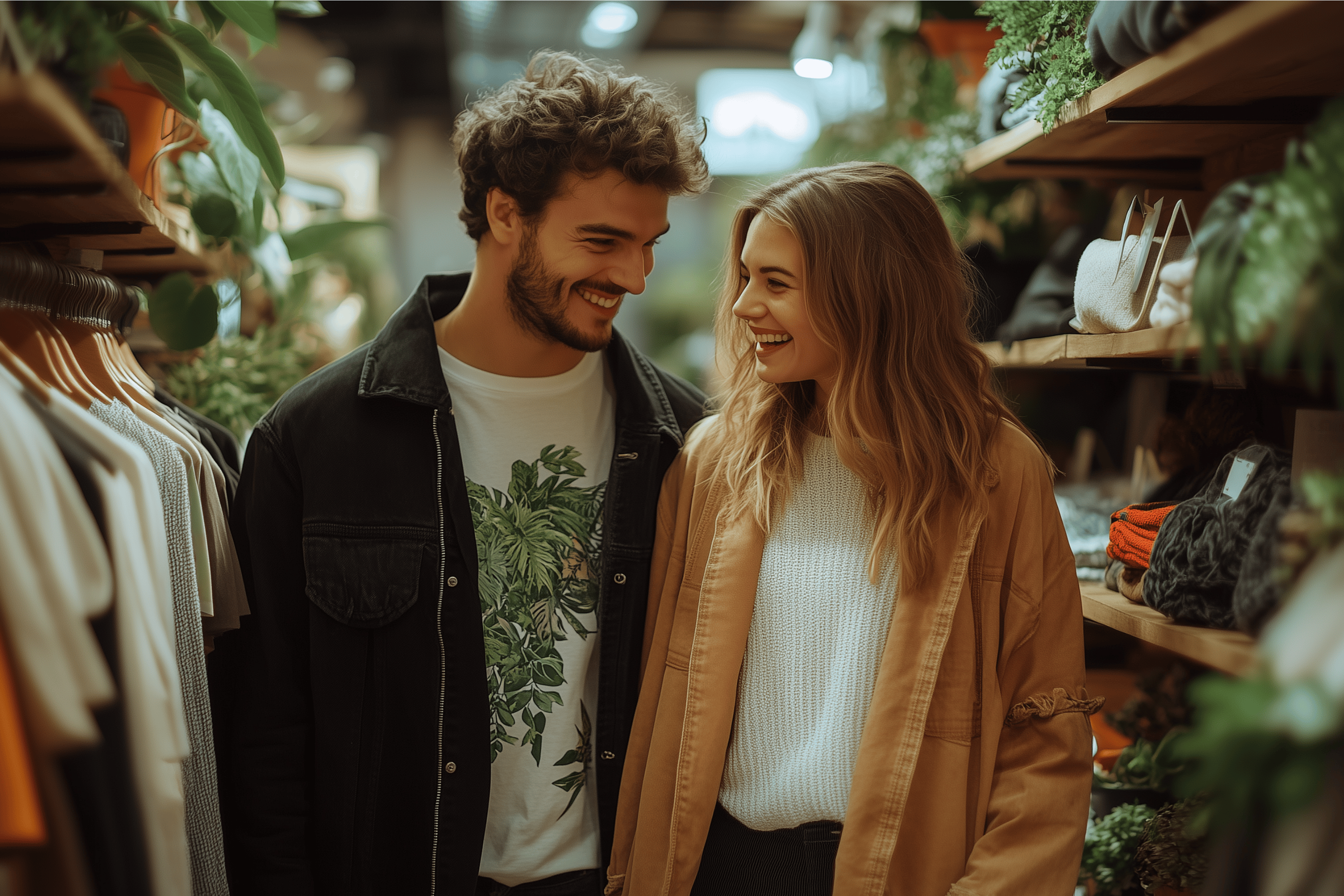
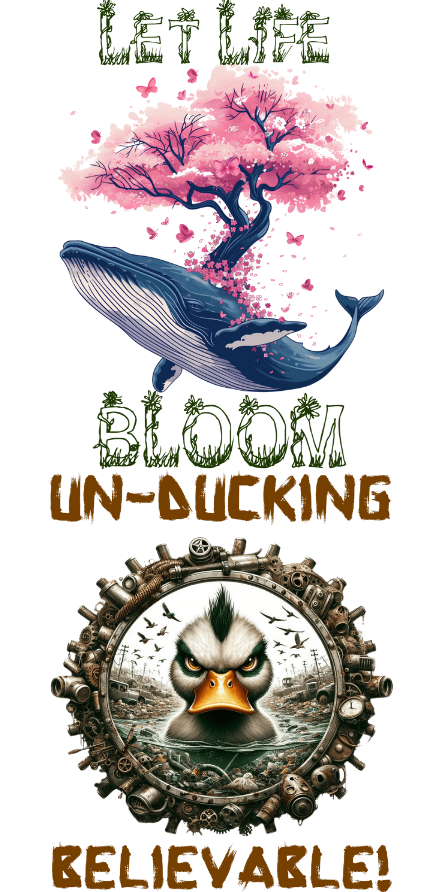
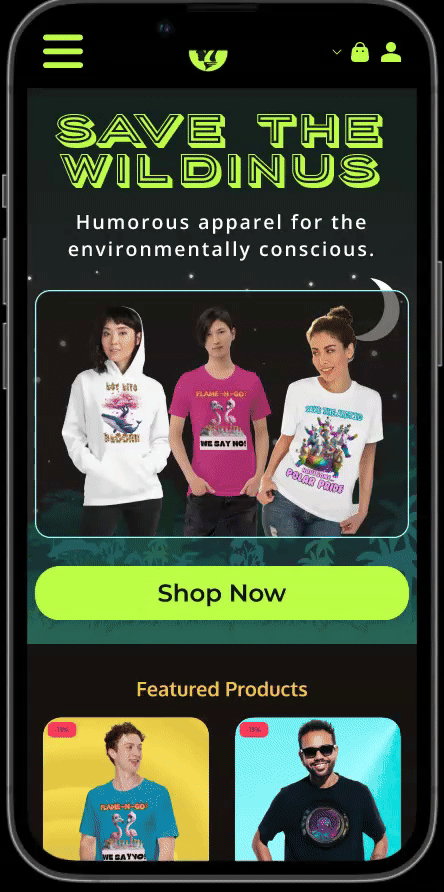
Fun Environmental Activist Wear
I created a series of pun-filled designs to spark conversation about deforestation, pollution, and climate change in a lighthearted way. Each piece combines vibrant color schemes with witty slogans so wearers can champion critical environmental causes.
Feedback
Users loved the playful twist on serious issues, saying it made them more comfortable to wear environmental concerns. However, the more overtly offensive designs and the readability of some were minor issues raised.
Early Findings
Shoppers wanted to feel part of a movement, not just a transaction.
The dull earthy-tone colour palette wasn't attracting the target market.
Buyers valued a smooth shopping experiences with easy paths to desired products.
An art-focused shopping experience puts visuals as the centerpiece.
Design
During the design phase I responded to customer feedback, turning the most important suggestions into catchy, cohesive branding, an expanded product catalogue, and high-fidelity mockups with a visually striking and user-friendly interface and intuitive user experience.
Actions I Took:
- Created a cohesive brand identity with vibrant colors, nature-inspired illustrations, and a logo that encapsulates wildlife conservation.
- Developed wireframes in Figma to outline key pages: Home, Categories, Product Detail, Cart, and Checkout.
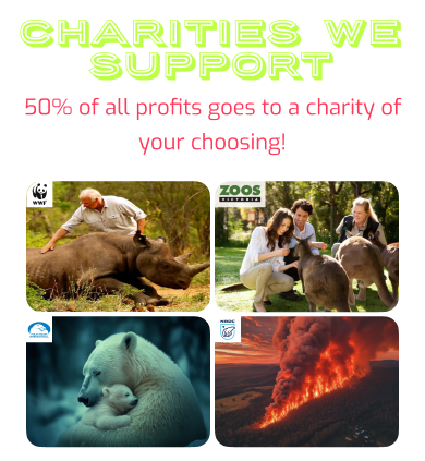
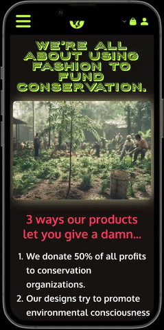
- Experimented with different ways to highlight the 50% donation on product pages, ensuring the message was front and center.
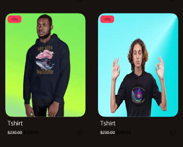
- Created numerous collections of art to meet customers demand for products beyond the 'fun activist' line.

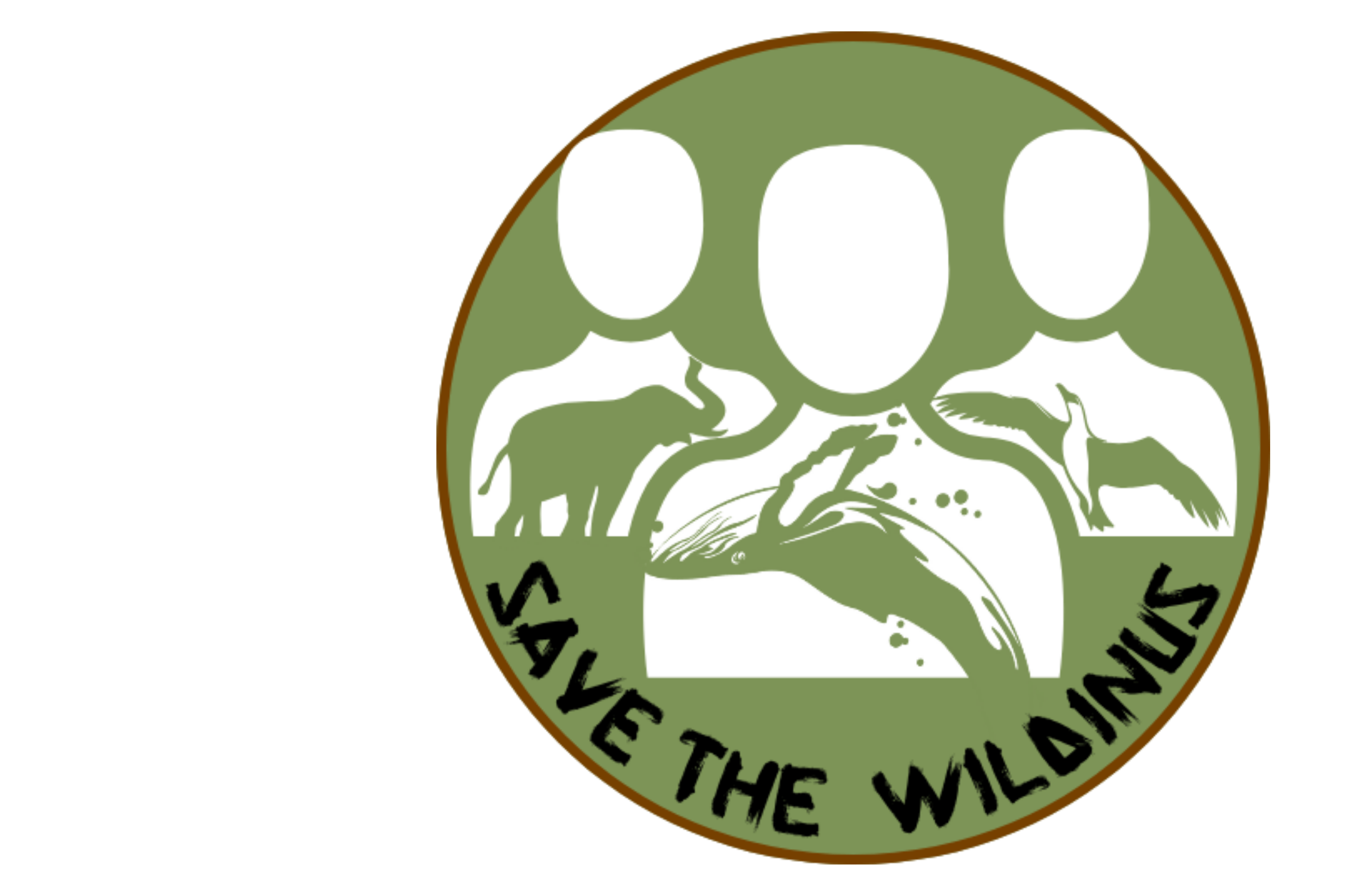
New versions of the logo were created and tested until we landed on simple, elegant and easily recognizable design that implied the importance of humans being more mindful of nature.
Prototype
I transformed the polished designs into a functional prototype, allowing stakeholders and potential customers to experience the site’s core functionalities firsthand.
Prototype Features:
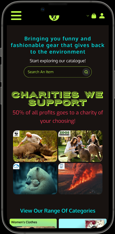
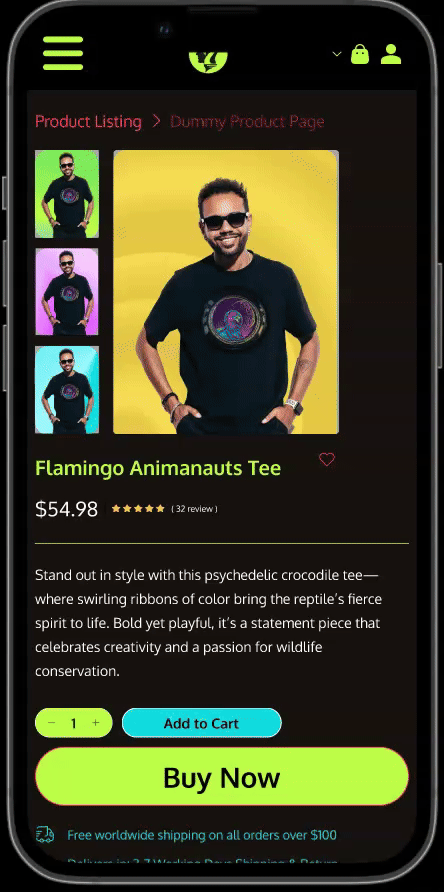
- Visually appealing Product Galleries: Product cards were intentionally made to be eye-grabbing and encourage users to explore.
- Charity model highlighted: On the homepage I outlined the 50% donation model and displayed the major conservation organizations we donate to.
- Popular and similar product sections: These sections were designed to streamline user flows and help them to find and suggest products they'll like.
- Cart & Checkout Flow: Streamlined steps to reduce friction, including a final confirmation screen that reiterated thanks for their purchase.
Test
Usability testing was conducted with a diverse group of participants—some were active in wildlife conservation, while others were new to eco-friendly brands.
I liked the colour scheme and t-shirt designs, I would definitely buy some of them!
Whilst the overall concept, look, & feel worked, user flows & product displays were not perfected & users wanted more details on charity conservation efforts.
I wanted to know more about the donation aspect. If I'm buying for a 'green' purpose, I need to know where and how my money is being spent.
Conclusions
Use some alternative display methods to the traditional gallery view.
Create filters to streamline user flows and further personalize the experience.
Reviews should accentuate but not overtake the overall user flow experience.
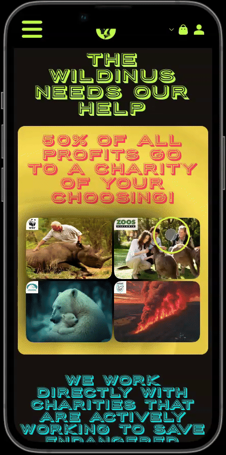
Make the charity/conservation aspects more prominent and make it clear where users money goes.
Iterate
Based on user feedback, I refined my prototype to ensure a smooth & engaging experience.
Designing for mobile-first adjustments, I revised breakpoints, button sizes, product displays and image scaling for better performance on various screen sizes. With these adjustments, I further tested the prototype and saw significant improvements in navigation, engagement, and clarity. The final user feedback indicated that the balance between aesthetic appeal and mission-driven transparency had reached a sweet spot.
To create the finalized prototype, I enacted various changes based on user feedback to improve the overall presentation of designs and improve user flows. These included:
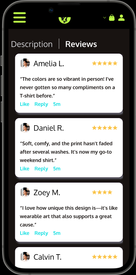
- Introduced Horizontal Scrolling: I made elements like the reviews and popular products sections interact using horizontal scrolling to reduce vertical scroll fatigue.
- Advanced Filtering: Added options to browse by category, collection, garment type or colour, and price, making it easier for users to find exactly what resonates with them.
- Interactive Product Galleries: Let users hover over a design to see donation details.
- Cart & Checkout Flow: Streamlined steps to reduce friction, including a final confirmation screen that reiterated the 50%donation.
The feedback about a lack of prominence and clarity surrounding the charity donation aspect was clearly heard and I adjusted the structure of the site to accommodate by:
- Streamlining Charity Info by creating an in-depth “Conservations Efforts” page highlighting each partner organization’s work. This helped to keep product pages focused on the designs and the shopping experience.
- Creating an About page to provide a backstory to the brand, adding a personal touch and providing authenticity.
- Empowering Users by allowing them to select which charity their donations go to at checkout.
The Final Product
The finalized Save the Wildinus store showcases a vibrant brand identity, an expanded product range (including non-activist designs), and clear charity donation messaging.
By iterating on user feedback, such as adding horizontal scrolling to reduce page clutter, refining product filtering, and emphasizing the 50% donation model, the final prototype strikes a balance between bold aesthetics and intuitive usability. These changes not only improved navigation and engagement but also highlighted the brand’s core mission of wildlife conservation, ensuring customers feel both inspired, informed and LOOKING SHARP!

Lessons Learned
Throughout the Save the Wildinus design process, I gained invaluable insights into user behavior, branding adaptation, and the importance of balancing aesthetics with functionality.
Here are some key takeaways that shaped the final product:


Copyright © 2024 Chris Kloester